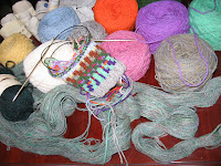
Here are color selections for the fair isle vest I've been playing around with designing in J&S 2 ply Shetland. The swatch has color attempts both usable and unusable. The decisions of the physical scene, the cartoon colors and the actual yarn shades provided an intriguing education.
Last June when I could do nothing but sometimes walk...sometimes sit...barely lie down or sleep after my flight down the stairs breaking my collarbone into three pieces with much soreness everywhere but the collarbone, I stood on the back porch absorbing the crystal sharpness of early morning sunshine in the back yard. The colors, both sharp and muted, cried out to become a fair isle vest. Not much was speaking to me then in my fog. I drew up a cartoon. At Retreat 2.75 in July, Janine wanted to see my Fair Isle notebook, so she perused the notebook and the cartoon. We were both pleased with the extension of the original design and looked forward to color swatching. One week this early Fall I worked on the swatch...everything's been waiting for me since then.
If we do get snow showers this afternoon, it might be a good time to work with June colors!
4 comments:
color play is fun and imaginative. you might consider an almost black as shadow to make your brights sparkle. if the dark green in the skein is the green in the swatch, you could go even darker still. nature always has shadows and add mystery to the creation, enchanting the beholder. Layl, the Yarn Vixen
yes, that could work. but what is being attempted is a traditional fair isle patterning that mirrors what i saw in color and form. can't start with the 'simple', can i?
but what you saw, and may not have realized it, was dark shadows down low against the light colors - that's what made them sparkle. per my art instructor where we had to make our own black oil paint color - and it was more beautiful than any black in the tube. But given i know little about f.i. color & patterns i may be wrong for this project. Layl the Yarn Vixen
With computer monitors never quite sure of the color you have so it hard to give an accurate opinion. Lt. blue looks almost white (at lest I think it is lt. blue) in the knitted swatch on mine.
You have heather type yarn that contains the some of the colors you want to use. Another thought would to be using shades or tones (could be darker or lighter) of some of the colors to bring them out of the yarn, but also to highlight the base color in the yarn. Trying to picture garden in June back there. Maybe green/blue back grounds and colors for accents. Green plants showing off their colors or flowers against sky.
Yarn Elf
Post a Comment